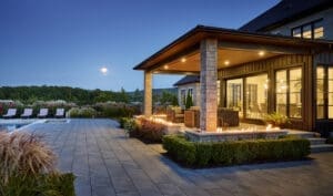


In 2026, luxury interiors have left behind the safety of greige palettes and whisper-quiet neutrals. High-end homeowners — particularly in sophisticated southern Ontario markets like Hamilton, Ancaster, Dundas, and the Niagara region — are embracing bold colors and color drenching as the defining signature of truly personal, confident, and luxurious spaces.
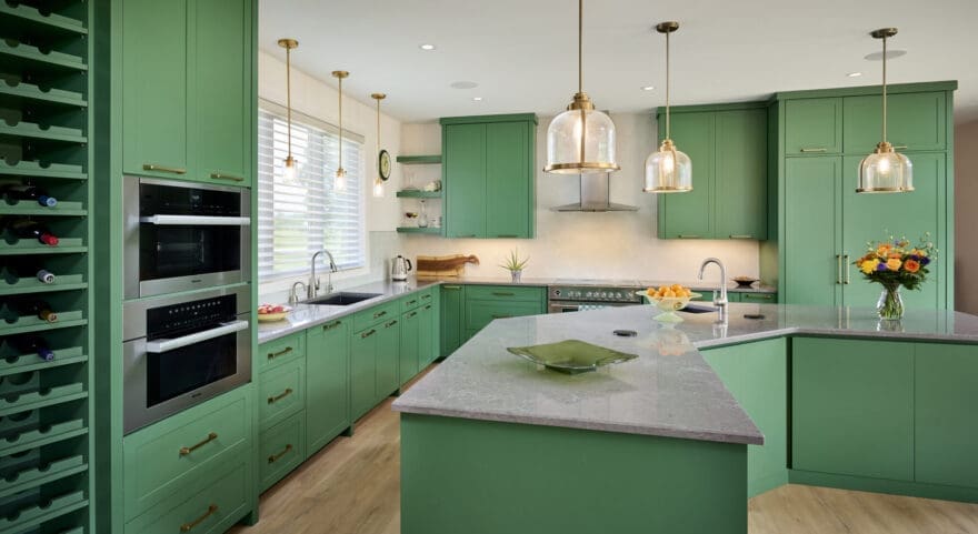
This isn’t about loud or garish decoration. It’s about intention: using rich, saturated hues to wrap entire rooms (walls, ceilings, trim, even cabinetry) in a single powerful color, creating immersive, jewel-box environments that feel both dramatic and deeply comforting. Color drenching turns architecture into emotion, making homes feel alive, layered, and unmistakably bespoke.
At Homes by Hendriks, we’ve seen this shift accelerate in our custom builds and luxury renovations. Clients want spaces that reflect their personality with the same level of conviction they bring to art collections, travel memories, or career achievements. Here’s how bold colors and color drenching are reshaping high-end design in 2026 — and how to make them work beautifully in your home.
Why Bold Color Drenching Feels So Right Now
After years of restraint, there’s a collective craving for joy, depth, and drama at home. Color drenching delivers:
- Emotional impact — A single hue envelops you, lowering visual noise and heightening intimacy.
- Architectural enhancement — It blurs boundaries between surfaces, making rooms feel larger, taller, or more cocoon-like.
- Timeless sophistication — When executed with quality materials and thoughtful lighting, bold color reads as luxurious rather than trendy.
- Perfect counterbalance — In Ontario’s often grey winters, rich tones bring warmth and vitality indoors.
The Standout Bold Colors Defining Luxury in 2026
These hues dominate high-end palettes right now:
- Deep Jewel Tones — Emerald, sapphire, amethyst, ruby — rich and regal, especially when drenched floor-to-ceiling.
- Warm Earth Reds & Terracottas — Burnt sienna, rust, spiced brick — grounding yet energetic, evoking vineyard soils and escarpment sunsets.
- Moody Blues & Teals — Midnight navy, peacock, deep teal — serene yet statement-making, perfect for primary suites and libraries.
- Rich Greens — Forest, olive, malachite — nature-inspired and endlessly versatile, especially in homes with escarpment or Niagara views.
- Unexpected Warm Neutrals Gone Bold — Chocolate brown, caramelized aubergine, burnt ochre — sophisticated alternatives to black that feel modern and inviting.
How to Master Color Drenching in a High-End Home
- Commit Fully (or Not at All) Half-measures dilute the effect. Paint walls, ceiling, baseboards, crown moulding, and doors the same color. Use matte or eggshell finishes for walls and slightly glossier trim for subtle definition. In one recent Hamilton project, we drenched a formal dining room in deep emerald — ceiling included — transforming it into a dramatic, intimate jewel box that clients now use daily rather than just for holidays.
- Layer Tonal Variations Use the same color family in different sheens and undertones. A matte wall paired with satin millwork and high-gloss lacquered cabinetry in the same hue creates depth without introducing competing colors.
- Balance with Texture and Light Bold color drenching shines brightest when paired with luxurious, tactile materials: velvet upholstery, bouclé seating, aged brass, patinated metals, natural stone, and wood with visible grain. Strategic lighting — recessed, picture lights, layered sconces — prevents flatness and brings the color to life throughout the day.
- Create Moments of Relief Even in drenched rooms, introduce small neutral or metallic accents (cream textiles, antiqued mirrors, brushed bronze) to give the eye rest. Large windows with natural light or views of greenery also provide essential contrast.
- Choose Rooms Strategically
- Primary suites: Deep teal or moody plum for cocoon-like calm
- Libraries or studies: Forest green or chocolate for focus and richness
- Dining rooms: Terracotta or ruby for warmth and drama
- Powder rooms: The perfect place to go bold — small space, big impact
Common Mistakes to Avoid
- Using low-quality paint — Invest in premium brands with rich pigmentation (Farrow & Ball, Benjamin Moore Aura, Sherwin-Williams Emerald).
- Ignoring undertones — A cool blue in a north-facing room can feel icy; test swatches at different times of day.
- Over-lighting — Too much bright white light flattens bold color. Use warm bulbs (2700–3000K) and dimmers.
- Forgetting flow — Carry a thread of the color (a pillow, artwork, rug) into adjacent spaces for cohesion.
Bringing Bold Color Drenching to Your Southern Ontario Home
Contact Homes by Hendriks today for a complimentary consultation. Let’s turn bold color into the signature of your forever home.
Homes by Hendriks — Where personality meets unparalleled luxury, one courageous hue at a time.